Most eCommerce sites have many pages: home, product, About Us, and product category page. People often believe that the main page is enough to hook the visitors on their site, but it is not really true. The product searches using search engines clearly states that your potential buyers can absolutely fall into any page.
Whenever a visitor comes to your site, he wants to see something interesting. He should get enough motivation and a sense of safekeeping to make a purchase. It is vital to provide security about the safe transfer of personal data without any risk.
Any customer should give an affirmative answer to this question, “Can I trust them?” As soon as he checks out the first page of your site.
The very idea that a potential client can appear on any page and has led to an increase in the popularity of landing pages. The visitor always falls first there(the English word “landing” is formed from “land on” – “land”, “turn out”)
Potential customers can get to the landing page in different ways – through organic search, posts on social networks, paid campaigns and emails. Even though all of them are landing pages, the most important are those that receive traffic from paid search or PPC campaigns (PPC, Pay Per Click – “pay per click”).
Are PPC landings so important? Yes, because you pay for advertising! So the received traffic is not free. Store owners expect a positive result on their paid advertising campaigns in many Investments. It should be both in terms of profit and the number of customers acquired.
With all this in mind, let’s talk about landing pages in eCommerce in the context of Conversion Rate Optimization (CRO) for paid search campaigns. Whereas several successful leaders in this area define it saying each PPC campaign should have its own landing page.
The difference between SaaS and eCommerce landing pages
Many articles about landing pages speak of landing pages in the field of providing software as a service (Software-as-a-Service, SaaS).
Such single-page sites are explicitly made for promoting one product or service. The undivided focus on a single product/service simplifies the situation: you know what exactly you should include in the content to convert visitors. Besides, landing pages dedicated to a single product (even with custom options) are generally easier to promote with PPC.
On the contrary, an eCommerce site is likely to have several products (sometimes hundreds or even thousands). It means that selling products according to the principle outlined above, you would have to create some landing pages and marketing campaigns to lead buyers to a product.
Since this is resource-intensive, many e-commerce sites use their product pages, like landing pages.
From a search perspective, product pages are the most suitable landing pages.
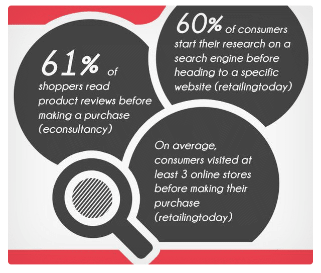
Most consumers who shop online use just the product name. Technically, 60% of potential buyers enter the name of the product in the search engine initially.
If your Product Page is configured correctly, then its content – especially the title or description of the product – should appear in the search results.
What you need to know before you start paying for traffic
Getting potential customers directly to the product page means you have given meaningful content to motivate the consumers. This is the key to high conversions.
You just need to make sure that your offer is clear, inspires confidence and does not create friction (Friction). The last aspect is the main obstacle to the conversion action. Friction is created when the customers are not willing to complete the steps in the conversion process. This may be the result of purely technical problems, difficulties in using the site or the presence of inadequate content.
Your goal is to make the buying process simple and hassle-free against competitors. 61% of buyers read or watch reviews, about the same as comparing similar products on different sites.
That is why your site should stand out and show how easy the shopping process is with you. A considerable proportion of potential customers (69%) leave if the process seems too complicated for them. Half will close the site if they have doubts about the security of payments.
Cost and delivery speed also affect eCommerce sales. 6 out of 10 customers will leave the basket if they see that the delivery is not free, and 51% will go if it is too long.
Have you ever dealt with these two parameters? Congratulations if yes. Now let’s take a look at the main elements of a product page that allow it to function effectively as a landing page.
6 Elements of an Effective Product Page
1. An appealing heading that clearly highlights the product
The title is an essential element of the page because it is easily visible. On product pages, the title is often the name of the product itself. Formulate the heading as close as possible to that set of words that the potential customers will search for.
Keep your title similar to the product when you launch a campaign like PPC. The title of the advertisement should also look like the title of the product page.
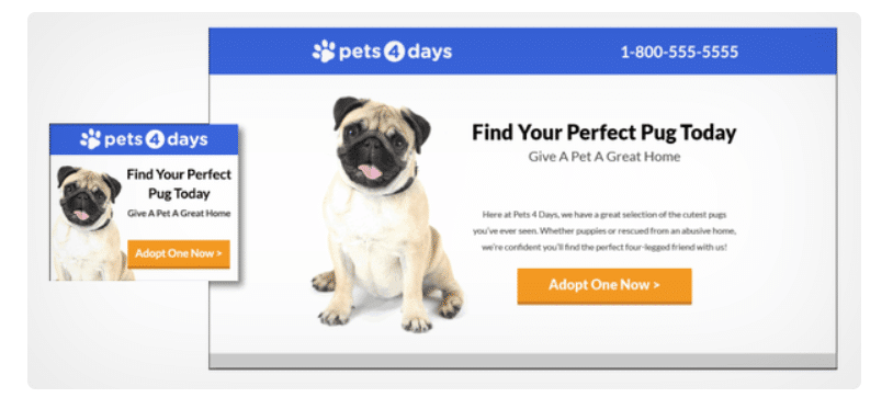
Go for a catchy title to make your product different from others on the network. It should convey to visitors a unique value proposition (Unique Value Proposition, UVP)
2. Convincing and informative product description text
The text of your product page should at least:
· Describe the product: its design, material, general appearance and size;
· Mark possible uses;
· Explain its advantages and benefits, that is, how the product solves the problems of the user and makes his life more comfortable.
A good description not only helps you sell but can also be used as the basis for a PPC campaign. Partial use of this text in advertising makes it easier to find a product and encourages users to click on the ad.
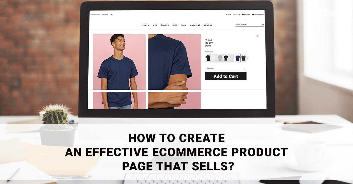
3. Professional high-resolution images
Quality photos give the page value and build a sense of trust among the audience. One can easily convey product features through professionally shot photographs.
Images should eliminate distrust and inspire the desire to get the product. To achieve this, you need to convince potential customers that the product is real. Allow them to study it in detail and make them understand that immediately after paying the site will provide quick delivery.
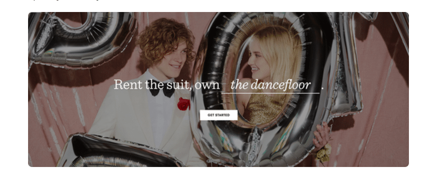
Photos also help to present the product in a specific context. Try to represent the situations that reflect its actual use (for example, you can show your stain remover against a washing machine). In addition to static images, you can also use video on landing pages.
4. Transparency in shipping and inventory information
The delivery policy significantly affects the purchasing decision. The fast and free delivery option can persuade people to buy from your site.
Which such advantages your product page should immediately convince them. Especially if traffic comes to it from a PPC campaign.
If you are unable to offer free shipping for each product, provide it for a specific minimum order value. Or you can give it for purchases with several commodity items.
You can reflect the quantity left in stock (if it is minimal) to show the limitations of the product. This creates a feeling of shortage in stock, encouraging them to buy while there is still a chance.
5. Robust payment policies and security indicators
Many consumers decide to leave the online store when the payment options or the site does not look completely trustworthy. Offer as many payment methods as possible to overcome this barrier.
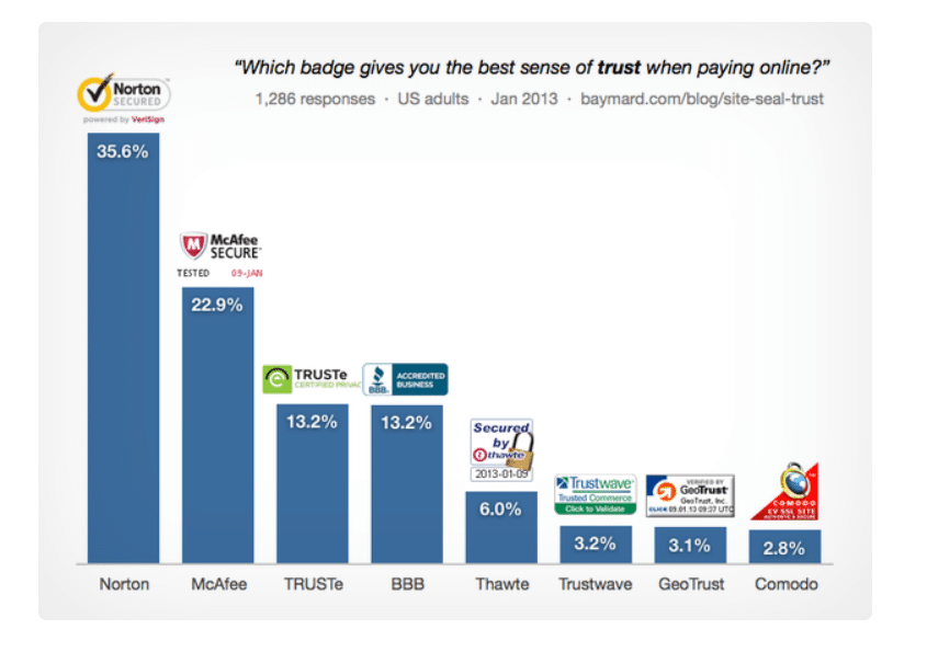
Try to offer at least one third-party payment system like PayPal. Thankfully the client does not have to disclose his personal data in your store.
You encourage confidence in the payment procedure by letting people pay for the basket as a guest (without registering on the site).
6. Reviews and social evidence
Although all of the elements listed are important, this is absolutely critical. Remember the study that found that 61% of potential customers are looking for reviews on the Internet? You can save people’s time for this custom research by putting reviews on the product page itself. Include the opinions of real customers of both good and bad. Or you can include a link to trusted browsers elsewhere.
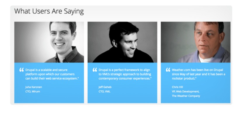
Enabling reviews with social proof and other signs of confidence – you can describe the best quality of your product. If a peer group provides solid proof about the goodness of the product, then they will surely go for buying it.
How to customize a PPC campaign for a specific product page
Message Correspondence
Remember this tip while creating a marketing campaign that sends users to the product page. Make sure that the advertising content (both text and design) is associated with the product page and vice versa. This principle is called the relevance or coincidence of the messages. With its help, you can convince customers to find what they were looking for. It can also increase your landing page quality factor (Quality Score).
Take a look at the following example-
We’ll enter the model name “Canon EOS Rebel T6i” into the search engine and get PV-advertising of QVC and Best Buy stores. QVC sells Canon digital cameras. They are the ones included in the title of their ad. However, the text of the advertisement used an underlying message. It included links to entirely different products that does not correspond to a specific product:

QVC ad: “Canon EOS Rebel T6i digital camera with Wi-Fi and HD video. Buy computers, tablets, televisions, cameras, and more for your budget. Free offers on used goods are available. Purchase items not shown on TV. Products for the smart home. Buy electronic equipment for stocks. The technique for students on the eve of the school year. “This is an example of a poor relevance/match message in PPC advertising
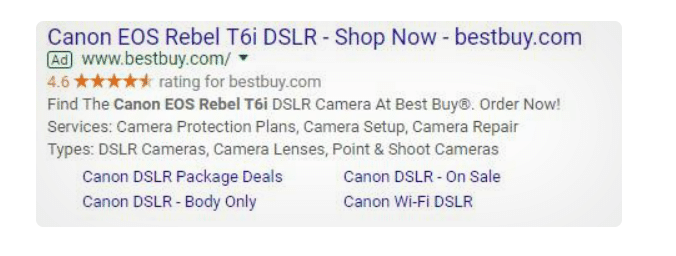
Best Buy, by contrast, launched a competitive ad:
Best Buy Advertising: “Canon EOS Rebel T6i Digital SLR Camera – Buy Now – bestbuy.com. Find your Canon EOS Rebel T6i Digital Camera on Best Buy®. Order now! Services: camera protection packages, camera setup, repair. Types: digital single-lens reflex camera, lenses for cameras, “soap dishes”. Special offers for Canon Digital SLR Cameras. Canon DSLR cameras are body only. Canon Digital SLR Cameras – On Sale. Canon Digital SLR Cameras with Wi-Fi.” Best Buy gives all the essential information about the camera.
Both companies were able to give a headline corresponding to the name of the product. But Best Buy advertising turned out better. They also showed the name of the product in the advertising text and added links leading to the desired product pages.
Comprehensive keyword coverage
Try to reach as many relevant keywords as people type while searching in your PPC campaign. This increases the chances of finding the products quickly. Do extensive research to understand which words and phrases are used to find your product. Incorporate those keywords into your PPC strategy.
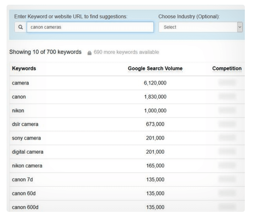
You can expand your keyword reach by adding variations to existing keywords and eliminating irrelevant ones. Keywords should be presented in the text of the product description to improve the quality of landing pages. It is meant to strengthen the message that attracts users.
How to turn categorical product pages into successful landing pages
Product pages have one obvious minus – fragmented product placement segmentation. This makes it difficult for visitors to view other products that are more suitable for their needs.
However, there is another potential page that can serve as a landing page: a page with product categories.
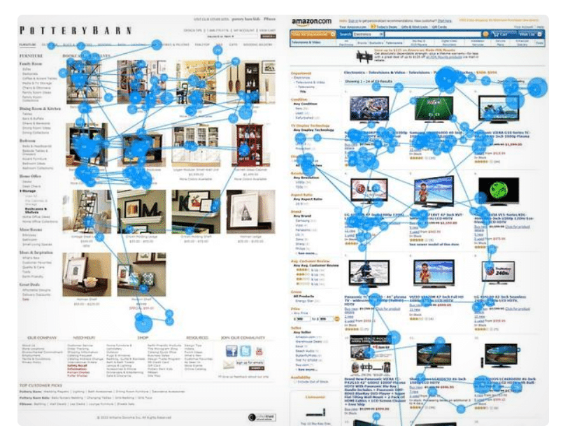
Categorical pages are an indispensable element of any eCommerce store offering many different products. These pages allow potential customers to quickly access and compare the variety of products. Their occurrence in the search results is higher when the user types a more general and non-specific term when searching for a product.
These pages have another advantage as landing pages. They contain many products that match the original search query. Therefore a higher percentage of customers easily find a product suitable for them and then convert.
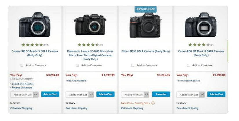
Similar confidence indicators like delivery options or discounts can be displayed on the product categories page. There will be no direct social evidence (e.g. reviews) posted on individual product pages. You can use indicators inside product thumbnails to demonstrate social proof. For example, you can access ratings in the form of stars or numbers next to each product as done here:
How to customize a PPC campaign for a categorical product page
The basic principle used to advertise content for a specific product page works for particular pages too.
It is not advised to use individual matching keywords (and thus linking to a specific product). Your PPC campaign should include a broad and relevant line of the mentioned products. For example, you can associate PPC ads with a categorical page. This is in case the user simply enters a “digital SLR camera” without a brand name or model.
And don’t forget to mention any discounts or promotions on the categories page. Discounts are a must for the entire product category.
Treat each page as a landing page
Using PPC campaigns to attract visitors to your online store makes sense for some cases. Like if users come to a page where they can perform an action. In most cases, this is not the main page of the site. You can include a single call to action on your product page to get an immediate response.
There is a possibility that you may lose some customers who research products on their mobile devices. Who plans to make a purchase at home using a computer may get success. To avoid this, consider turning on the “Add to Favorites” button to the main action button (“Buy” or “Add to Cart”) on the product page. Let the users create an account using their profile on popular social networks without registration. You can also invite them to subscribe to your mailing list.
You may have come across tips like “reduce navigation options” or “reduce the number of links” while reading about creating SaaS landing pages. All this does not apply to eCommerce. Reducing navigation helps reduce distractions but also prevents visitors from seeing other products or parts of your site. Sometimes just product or categorical pages may not be enough!
The most important rule for owners of electronic stores: perceive each product and the categorical page as a potential landing page. Use our recommendations to avoid many costly mistakes.
13 traits of a creative product landing page
Product landing pages – this is what marketers call online store product pages. The purpose of the product landing is to add the product to the basket. As a result of this, most eCommerce resources do not need to waste extra time and money. They quickly develop and test more attractive and compelling pages for their products.
How does effective product landing work?
It all comes down to an optimal User Experience (UX). The landing page should contain relevant and useful information to meet the goals. It must be organized in a way to facilitate the purchase process as much as possible.
1. Name
The name should describe the product. This will make your resource far more transparent for the buyer. Also, it will be more convenient for search engines. For example, “Ring without inserts from 14 karats red gold” is a more specific and practical name than just “Ring of gold”.
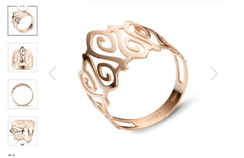
The name should be quite unique. This seems obvious, but you will be surprised to find a fact about names. Often in the online store, you can find dozens of identical positions. This greatly complicates the search negatively affecting the conversion rate.
2. Call to action button
This is the most essential element of any product landing. All button parameters – colour, size, text – affect the decision of the buyer. Accordingly, their development and testing require special attention.
The meaning of colours differs in different cultures. Keep in mind two factors when choosing a colour. Let the first colour of the target group cause an emotional response. The second let’s say is the colour of the call to action button matching the colour scheme of the page layout.
Remember that words mean different in different countries when you choose the text on the button. Amazon customized the text on the call to action button on the English and American versions of the site. A familiar word is used in the colloquial speech of buyers of one and another country.
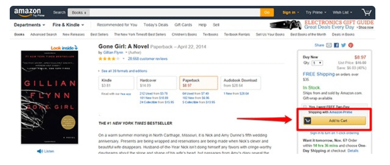
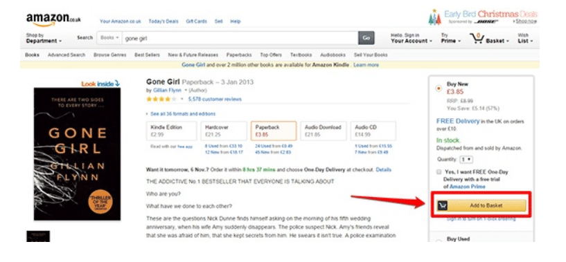
3. Price
It is worth paying attention to the appearance of the price tag.
The price should be located next to the buy button. The product name, price and call to action button should form a visual group. It should be with a consistent hierarchy to let the purchasing process pop naturally in the minds of buyers.
4. Images
It is difficult to overestimate the importance of photographs for creating an overall impression of the site. It also helps in increasing conversion and sales. For product landing, image loading time is critical. Remember that not all visitors may have a reasonably quick connection.
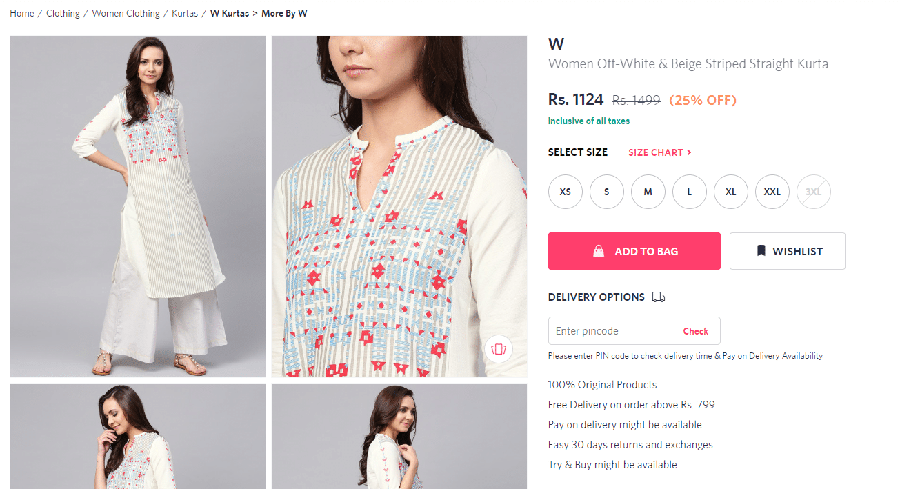
Download the product photo from different angles to see it well.
Use compelling and alluring photographs. For example, you can put a photo of a model wearing the costume on the dress page. This will make the product more desirable and add credibility to the situation of its use.
5. Quantity
The window occupies a small area for selecting the number of goods added to the basket. But it is good as it can lead to increased sales. For example, when someone wants to buy five books, he should be able to do it at once. He should not return back to the product landing, to click “Buy” 5 times. The absence of a quantity choice element means a potential loss of revenue.
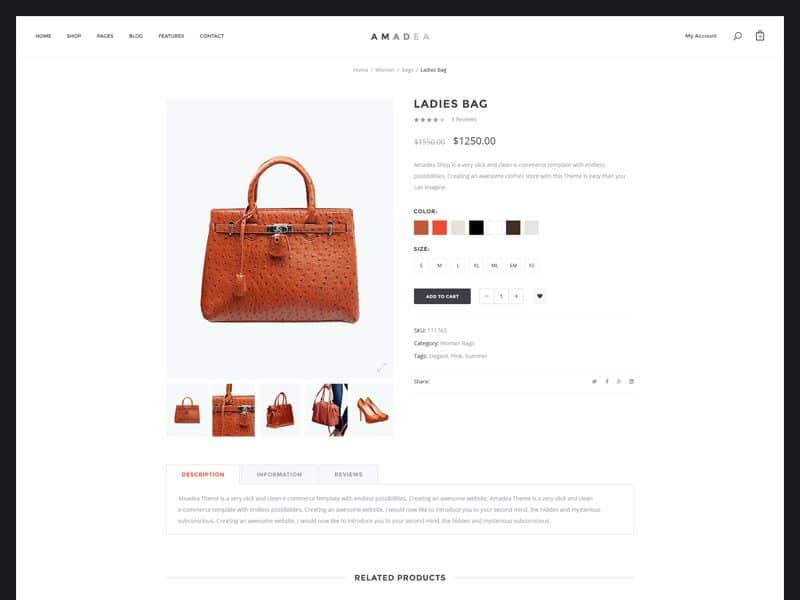
Amazea product landing pages do not allow you to select multiple instances. The buyer can do this only by going to the basket.
6. Reviews
According to studies, 63% of buyers will choose a product with reviews. Almost 61% of the buyers read reviews before making a purchase decision.
The problem with using this element is that there are usually too few reviews that can cause distrust. Use the eBay feedback model to increase the number of reviews. An email is sent to each client with a request to evaluate the transaction after making a purchase.
Many buyers consider this request as part of the purchase process and often fill out the form.
7. Wish-list
This item is especially useful for indecisive buyers who need time to make a decision. It is very beneficial when a user comes across a product he may need in future not now. This element makes it possible to take the goods “on a note” and return to it later.
8. Money Saved
The original price is also indicated nearby when the product is sold at a discount. This technique uses the fear of loss in profit and is used to stimulate sales.
Use the percentage and natural expression of the amount saved as a result of the discount. Different types of visitors will be susceptible to this or that type of message.
9. Cross-selling and upselling
Any online store owner wants the buyer to spend more than planned. Therefore the product landing page should use the elements of up-selling and cross-selling.
Cleverly selected similar products can improve the impression of working with the site. It also helps the visitor to study the main proposal in more detail.
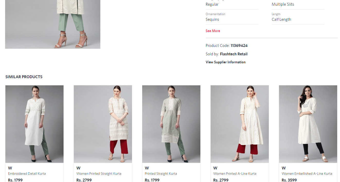
10. Shipping Information
Nothing is annoying like finding a high shipping cost and extra charges at the final stage of the purchase. Indicate the total cost of the goods with all mandatory margins and services. Always try to eliminate unpleasant surprises for your visitors.
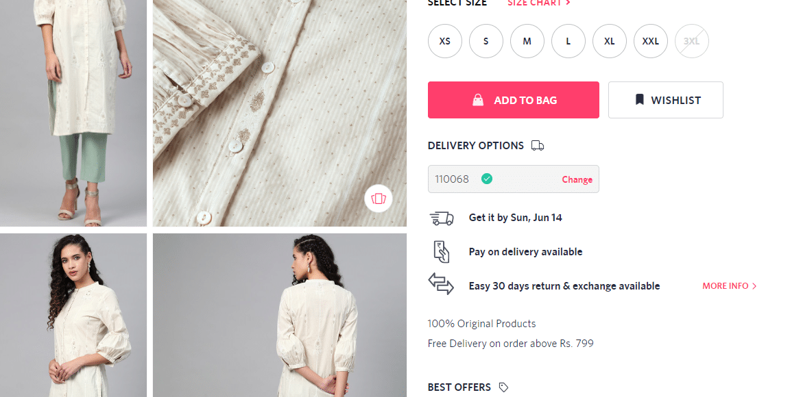
The online store Myntra posted information on the cost of delivery in the sidebar. The buyer sees it on any page of the resource and makes a quick decision then and there.
11. Online Consultant
Marketing agency Econsultancy’s communication with an online consultant was studied. It showed the highest level of customer satisfaction to be (73%) compared to other support channels: email (61%) and hotline (44%).
The visitor can not always find the answers they need in the description or in the product reviews. The visitor will leave to another resource in search of solutions if they are not satisfied.
12. Video content
Video is more visual and attractive than text. Many product landing pages use videos to convey both product information and engaging content.
13. “Breadcrumbs.”
Use the breadcrumbs navigation chain to let the visitor understand where he is.
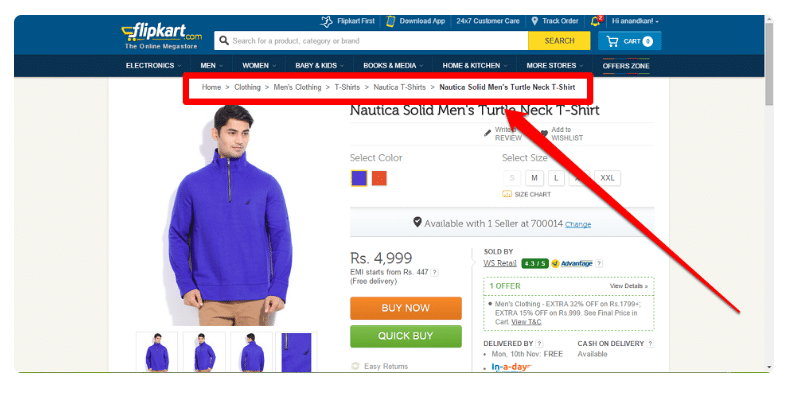
Such navigation will allow the visitor to understand the hierarchy of the resource. They can view other interesting pages easily after that. Additionally, you can reduce the bounce rate. It is the percentage of the number of visitors who left the product landing directly from the login page. Or the ones who viewed no more than one page of the resource.
Last tip: test. The best way to optimize your product landing page is to introduce new ideas. You can also test them with split testing.
23 hacks to increase the conversion of Ecommerce-landing
Are you sure that you are gaining the full potential of your landing pages for conversion? A recent Deloitte study says that 54% of visitors throw carts. The researchers found that about 96% of users are not always ready for purchase. Indeed not when they appear on the landing page of the online store. Still sure that your landing page is working fully?
But there is good news. The e-commerce sales are expected to grow to more than $ 400 billion by 2018 (forecast by eMarketer and Forrester research).
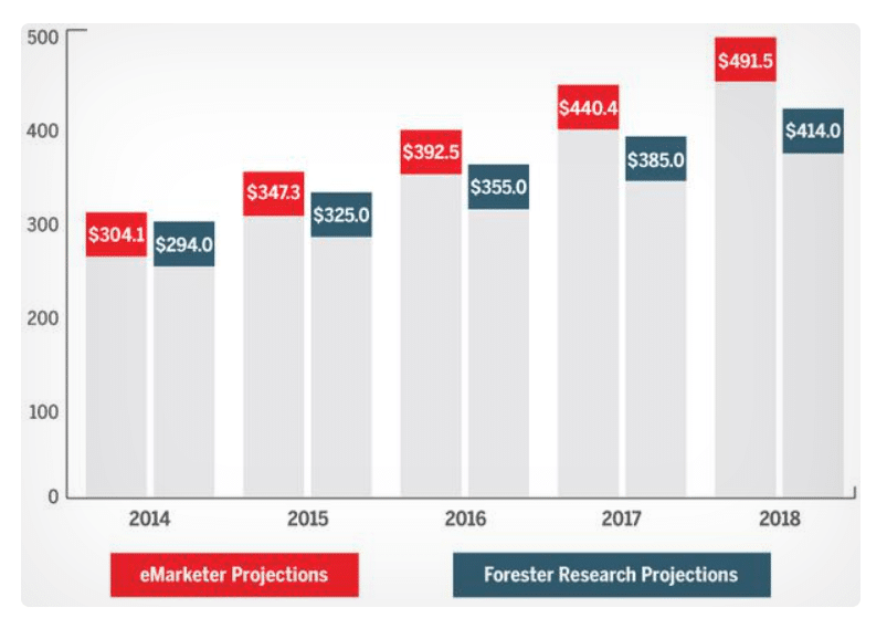
Want your business to confirm this positive outlook? Test these 23 hacks for eCommerce landing pages. You will see your conversion rate increase significantly.
1. Use only high-quality product images
Do not forget to show users the value of the product. Along with textual content, you can also use photos to glorify the product. The user will get the visual experience before they learn about all the benefits. Remember and do not neglect this in sales that most people “love with their eyes”.
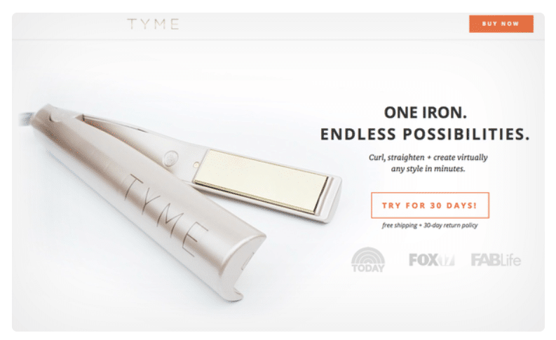
An example of a landing with a high-quality photograph close-up:
Marketers decided here to include a photo of the product in action:
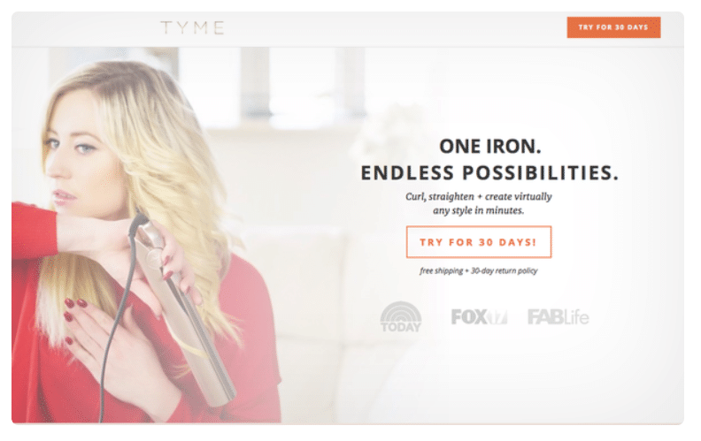
Which is better? It would seem that an integral part of a promotion is showing the product in action. However, using the second photo as the main one can be risky. You cannot use the product correctly and show its full benefits. You probably won’t understand how this device differs from competitors’ offers. You will see the drop in conversion rate by 44% by using only the second photo.
2. Build trust
You can gain the confidence of customers by showing them proof of your reliability. You can include customer reviews or comment in the form of text or videos to support the evidence.
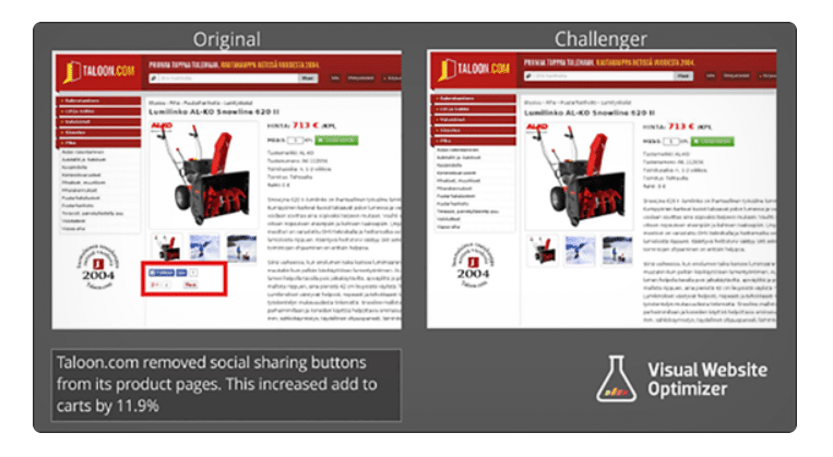
Taloon Landing Conversion increased by 11.9% after a particular event. Specifically, after the developers removed the social network buttons on the product page.
Reviews will also help increase conversion:
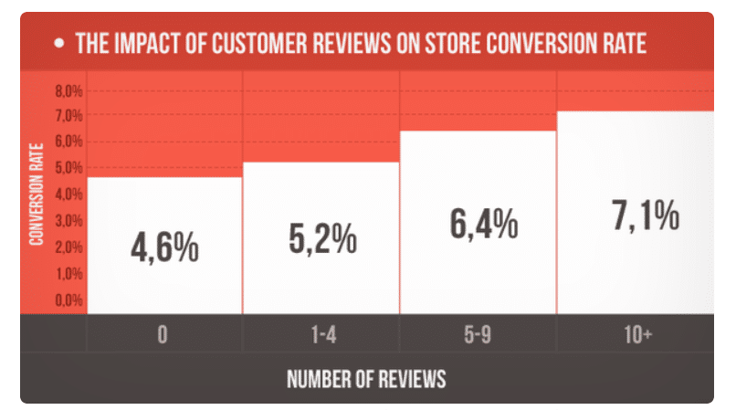
The effect of the number of reviews on the conversion rate.
At the same time, do not delete bad reviews. Users tend to trust reviews more if the landing page contains both good and bad comments. This creates a more realistic picture.
Customers convert up to 85% more if they interact including bad reviews, says Revoo.
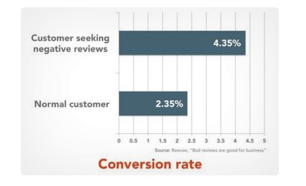
The first rating is for users who are looking for negative reviews. The second for ordinary users.
3. Offer discounts
It is discounts that encourage users to click the CTA button. They simply cannot resist a relevant offer. Discounts are a great way to acquire new customers according to Yoast specialists. It is also a great option to show your appreciation and gratitude to existing ones. You can display their value for your business.
Corkscrew Wine Merchants added a 15% discount on landing that increased the conversion to 148.3%.
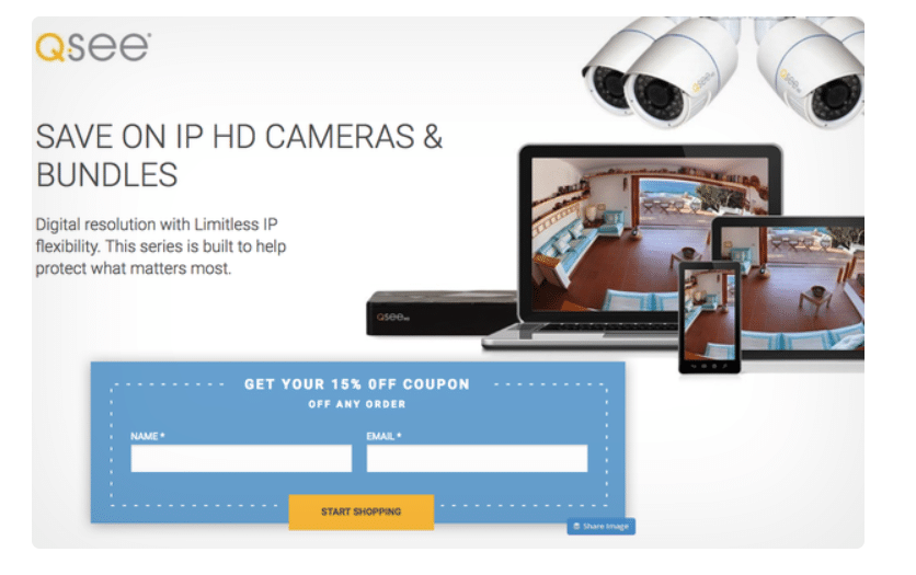
Example of landing Q-See at a discount:
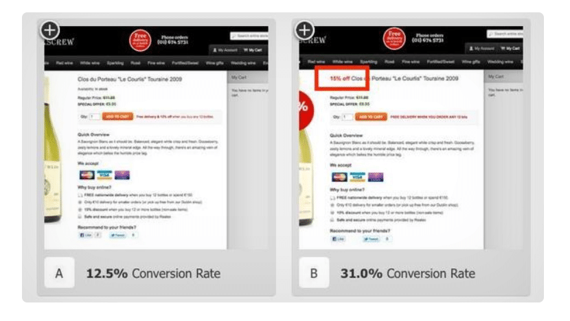
The conversion increased by 4% when the discount was included in the headline:
4. Create clear CTA buttons
The user will perform the action only when the call is clear. Otherwise, the chances of taking action are meagre.
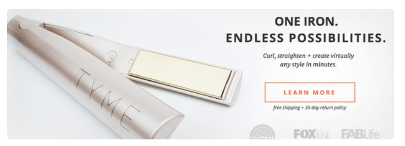
Designer Olivia Taylor decided something different while working on the landing page of TYME. That was to put three buttons at various stages for making the purchase decision of the product.
A button with the call “Learn more” at the familiarization stage caused minimum anxiety on users:
Intermediate level – “Try for 30 days!”
This button is for the stages of interest and consideration:
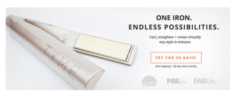
The highest level is at the final stage when the user makes a decision.
Buy Now Button:
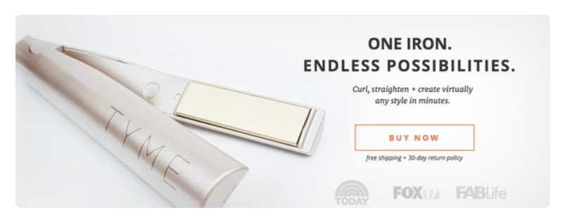
The following was revealed based on the test result: A better alternative compared to the “Learn more” button was found. The “Try for 30 days!” switch increased conversion by 18%. CTA Buy Now increased conversion by only 2%. Visitors of this landing page were at the review stage in the purchase decision cycle.
5. Include different CTAs for specific products.
It is suggested to use the images directly on the landing page along with buttons. This will also help increase conversion. Let’s take a look at this tip using the example of Q-See landing pages.
The initial version of the landing: one button “View Products”:
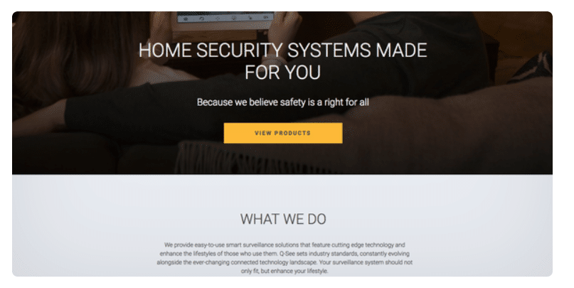
The final version included several Buy Now buttons for each product plus images:

As a result, the conversion increased to 124%.
6. Add a photo zoom feature
You can use scaling to increase your profit. It can help potential buyers to look at the product from all sides. It will help them make a decision. On top of it, you can add a rotation function.
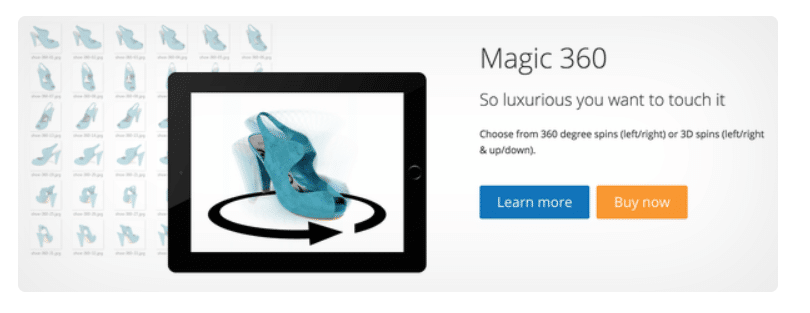
Igor Varyvoda of the Magic Toolbox helps increase conversion rate tremendously. The conversion rate increases from 2% to 40% depending on the image and type of product. The conversion improvement reaches 80% sometimes when using the zoom. And up to 100% when using the 360-degree rotation function.
7. Add product categories
Adding categories directly to the page will also help you close deals.
Black Friday Landing Example for Bold Commerce:
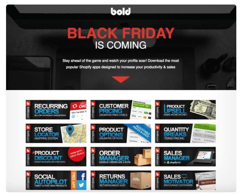
Categories in the form of cards help the visitor. They can immediately go to the purchase of goods of interest.
An example showing how Baby Gap uses categories (by child’s age):
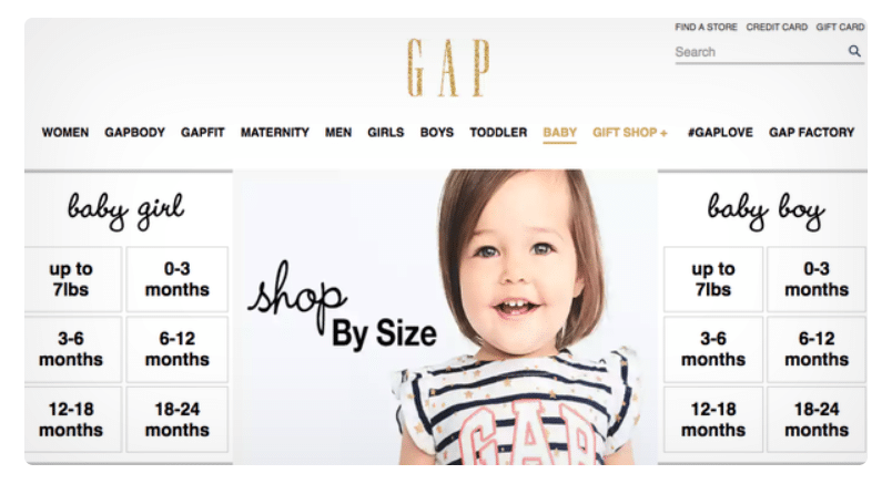
You can save your time using categories on the landing page. You get the opportunity to efficiently manage the products. In a regular and non-virtual store, things are laid out on shelves. They are divided into departments: for women, men or children. It would be bad for the store to throw off all the products in one pile. What is the likelihood that the user will find the right product? A virtual store uses the same principles.
8. Test the fields of the order form
Testing the length of the mould can significantly affect the conversion rate in the future. It is crucial to find out what and when to ask. So as not to frighten the user.
Namify uses four steps to fill out the form on the landing page. The index is already requested at the first step.
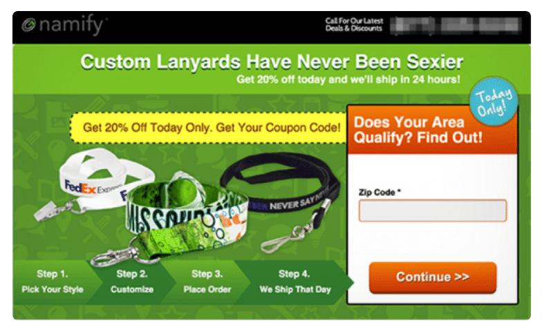
The improved form after testing allowed the company to increase conversion to 311%. It also reduced the cost per conversion by 73%.
9. Add online chat
Chat will help attract visitors to active interaction. You can promote them in the sales funnel and even increase the value of the order.
A Maru / Edu study discovered some statistics regarding this. Nearly a third (31%) currently use video chat from the survey of 2000 consumers. 73% said they were satisfied with this channel. 67% said they thought it was easy to use. Not surprisingly, chats are only gaining popularity over the years. Intuit turned on chat offering help in the middle of the checkout process.
Adding a chat increased the average order value by 43% and conversion by 20%. The developers also included a conversation on the product comparison page.
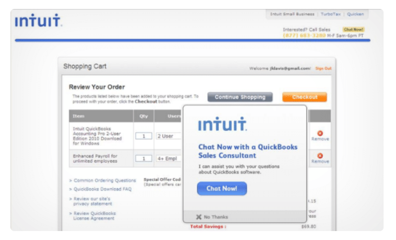
Result? The chat on this page has helped increase company sales by 211%. If you know that many store visitors throw baskets, why not make the best out of it? Why not take the initiative and help them make decisions both at an early stage?
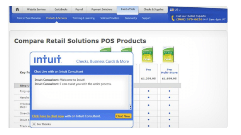
Chat will answer any questions that arise and even eliminate the effect of friction. Unlike communicating by email or telephone, your visitors can remain anonymous. It will make them feel more freedom and comfort.
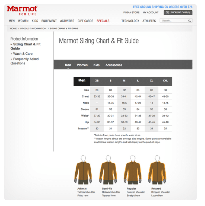
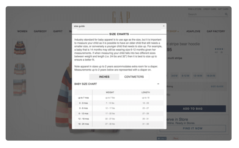
10. Add a link to product specifications
Knowing all the smallest details about the product will help users make a decision. Few of the landing visitors are ready to buy without knowing full benefits. Observe at what step you need to include a link to the most detailed information.
An example from Marmot with a size chart:
An example from Baby Gap: a pop-up window with a guide for sizing.
11. Use even items that are not in stock
Even if at the moment there are no products in your warehouse, do not remove them from the resource. You can use the lack of goods for your own purposes. For example, ask an interested visitor to leave your mail. So you will get notification when the product appears. So you get new contacts from the “warm” client, and you can grow communication with him by email.
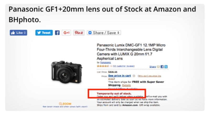
It is also worth indicating in the online store even if a few copies remain. The fear to miss the opportunity will push the visitor to make a purchase before it is too late.
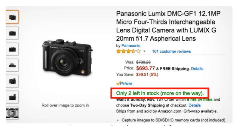
Amazon example: only 2 cameras left
That’s all for now. We shall discuss the remaining hacks for eCommerce landings in the next part..
12. Use wishlists
This simple tool allows you to save customers who are not yet ready to purchase. These are the ones who are interested in the product. Wishlists are essential as they perform several functions at once says the Big Commerce expert. Firstly, they encourage users to register or create an account. Then they leave their mail that you can subsequently use to promote goods. Secondly, you focus the user’s attention on the fact that the purchase is really desirable and possible.
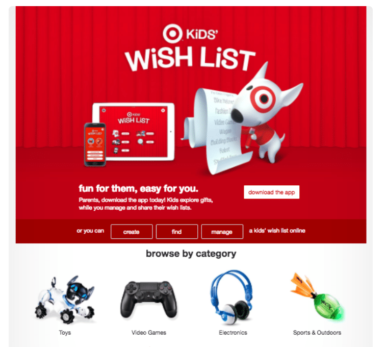
The rest is just a matter of your skilful strategy.
Some companies know the value of this marketing insurgent. They also build the entire landing page on this concept.
You can add small buttons that will allow visitors to create a wishlist during shopping. Here’s how Target does it.
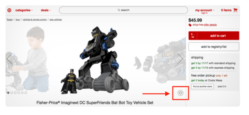
13. Personalized product recommendations
Recommended products are selected based on the visitor’s browsing history. This tool is an effective way to increase conversion. 31% of website revenue comes from the personalized recommendations according to a study by Barrilliance.
Tip: identify several series of similar products and choose the appropriate headings for them.
SmartInsights has tested over 20 different types of headings. Those include “What do other customers buy after viewing this product?”
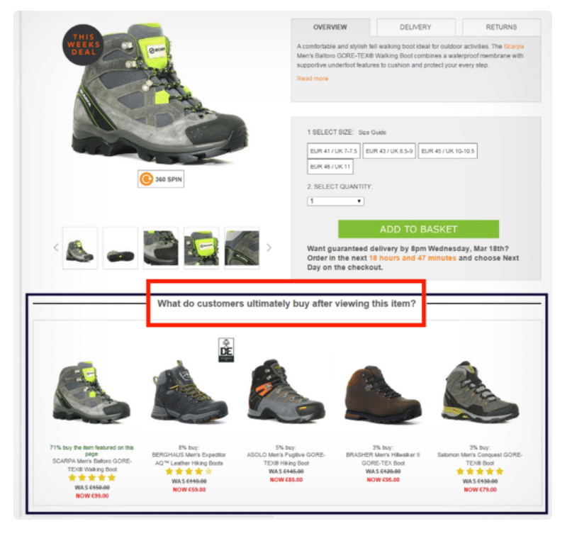
The winner among all types was the following: “What do you buy after viewing these products?”.
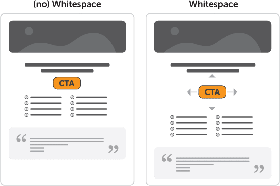
14. Leave an empty space (white space)
This design approach keeps the landing page clean, bright and focused. The fewer distractions, the higher the likelihood that the user will pay attention. It is highly probable that he will go for the call to action button.
The use of white space increases understanding by almost 20% says the study by Human Factors International.
For example, here’s how to create white space around a CTA:
15. Use the video
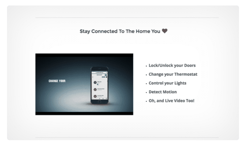
Video allows you to demonstrate all the advantages and value of the product. The user has to make an effort to even read a well written text. With video, everything is simpler – maximum visibility, minimum effort.
The video helps at the familiarization stage while promoting the user in the decision cycle. According to Internet Retailer, visitors who watch a video are up to 144% more likely to add a product to their cart. A survey involving more than 1000 respondents gave some promising results. It showed that 96% of video buyers help make a purchase decision. 73% admitted that they decided to buy it after watching the video.
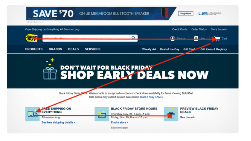
16. Do not forget about the visual hierarchy
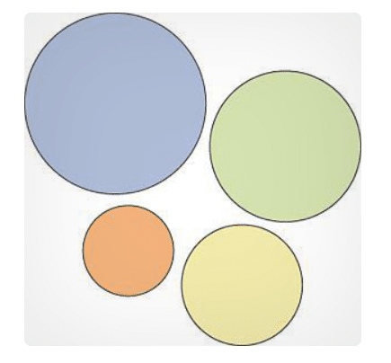
Follow the principles of the visual hierarchy to ensure the landing page fulfils a single purpose. The most significant element attracts the utmost attention when it comes to the size rule. Are you sure the most abundant item on the page is essential?
Consider the F-pattern: The researchers found that users read pages on the Internet in an F-shaped pattern.
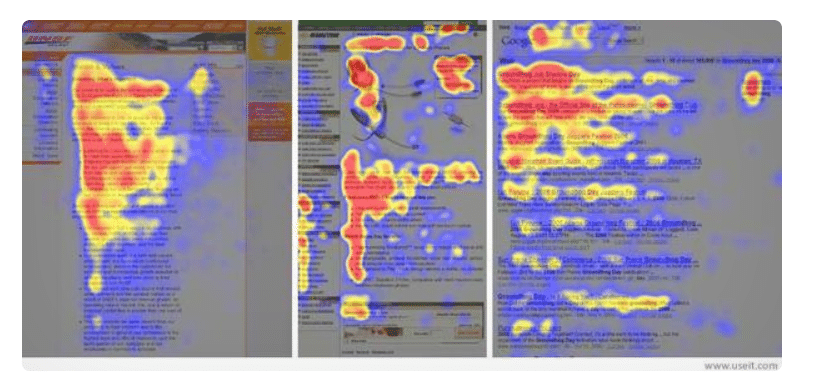
A heatmap that shows the view hierarchy. Try to put the most essential information in the red zones.
The Z-Pattern is better preferred for some landing pages with less information. The user’s gaze moves in a direction resembling the letter Z. Place the call to action button on the lower borders of the “letter” in this case.
An example of a Black Friday landing page from Best Buy.
Do not forget about colour contrast. Just make sure your CTA button stands out from the landing page.
An example of contrast highlighting.
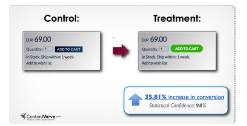
Changing the button’s colour from blue to green is essential for sales. It made it possible to increase the conversion rate by 35.81%.
17. Experiment with page length
Many users are looking for the most detailed product information. This means that the principle “less is better” is not always applicable to landings. Most of the profit depends on the type of product, landing design, etc. Testing is the only way to find out which page length is right for your store.
An example when a long landing converts better by 30%.
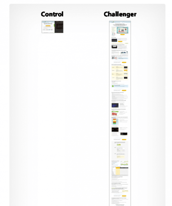
The winner of the contrary was a shorter version of the page.
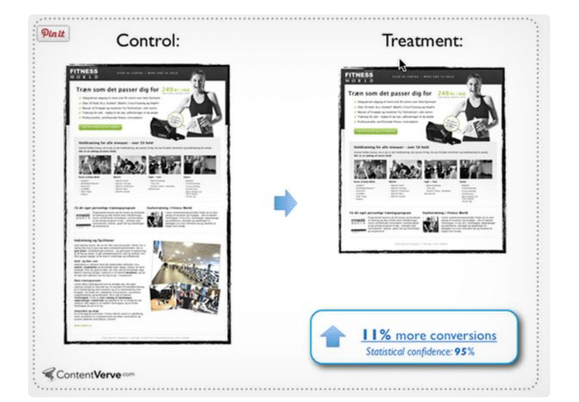
Short landing showed a coefficient of 11% more than long.
After all, the length of the landing doesn’t promote sales on its own. It is not the only factor responsible for the conversion rates in these cases. Testing the span of the landing page of an online store is a good idea. It will help you optimize your landing page.
18. Specify delivery information
Make sure that information on the date, time and cost of delivery is posted appropriately. It should be on the landing page, checkout and confirmation page. This will help to avoid misunderstanding. Statista study says that the most popular reason for not purchasing in the later stages is unforeseen expenses (56%).
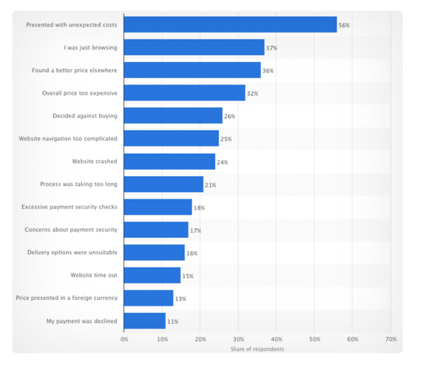
It’s worth testing how free shipping will increase conversion rates and average order value. Perhaps this is precisely what your customers are waiting for. 76% of consumers said that free shipping was significant by the comScore study. 47% said they would refuse to purchase if free shipping was not included.
A free shipping offer can increase sales by a considerable amount. NuFace gave free shipping for orders over $ 75. It successfully increased sales by 90% and average order value by 7.32%.
19. Add the notification “Added to cart.”
These notifications can act as an interactive feedback tool for your visitors. Use this method of confirmation for better response. Thereby, you can focus users on the fact that they are on the right track.
This type of feedback is essential for UX. According to Give Good UX, this is the key to answering many questions from visitors. Queries such as: “Is the product already in the basket or need something else to click?”, “Can I continue to shop or need to wait?” etc.
20. User Testing
It is worth starting the testing after making sure all the essential elements are added. Running various scripts can help optimize the landing page. You can make sure all the details on the landing page are easy to use and intuitive to visitors.
Three easy usability testing formats to try:
1. Personal testing (Moderated in-person) assumes that you observe and record all test results with the participation of a focus group. You should ask the participants’ opinions directly or through recording a task from the monitor screen.
2. Moderated remote testing. This type of testing is carried out remotely using screen-sharing tools.
3. Unmoderated remote testing. This format assumes that the study participant is working remotely with tasks. The recording is done through screencast. You can check out several UX features:
• Learnability
• Evidence (affordance)
• Navigation
• Memorability, etc.
21. Develop a unique value proposition
Your value proposition should be crystal clear and visible on the landing page. Let your visitors immediately know the benefits of the product!
Answer the questions: How will the product help visitors? Why is your product better than competitors? Show your unique value proposition. Tell about it and make it understandable to visitors of the landing page.
Marketing experiments show that the offer is one of the main variables in the high conversion formula.
22. Make contact information visible
You can reduce friction by placing contact information on the landing page. Visitors to your landing page will feel more confident and comfortable. Especially when they are not already familiar with your brand.
According to a study by E-Consultancy, more than 46% of users let their guard down by this. They trust the online stores where they see a contact phone number and address on-site.
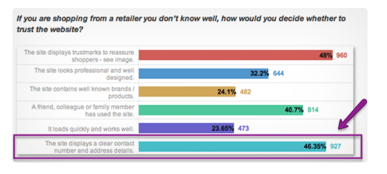
Visitors can get a solution if they have any questions at any stage of placing an order. They can quickly contact you and solve their problem.
Flowr conducted A / B testing using Kissmetrics to find out the importance of the contact information on the landing page. Results?
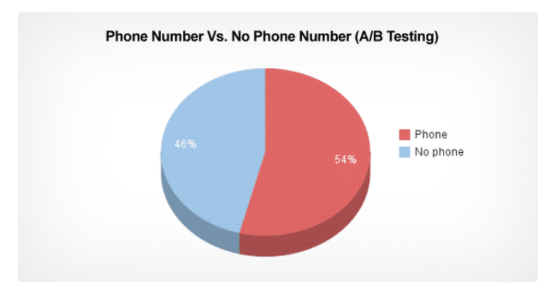
54% of the conversion took place on those resources where there is a phone number. 46% – where there is no number.
23. Add security icons? Think again
Adding a landing page in a link to the privacy policy is beneficial for users. Trust badges help encourage visitors to convert. In this case, they will feel safe making a purchase. However, do not mindlessly litter the landing page. The best way to find the perfect combination of elements is through testing.
Deleting these icons only plays into the hands of the business in some cases:
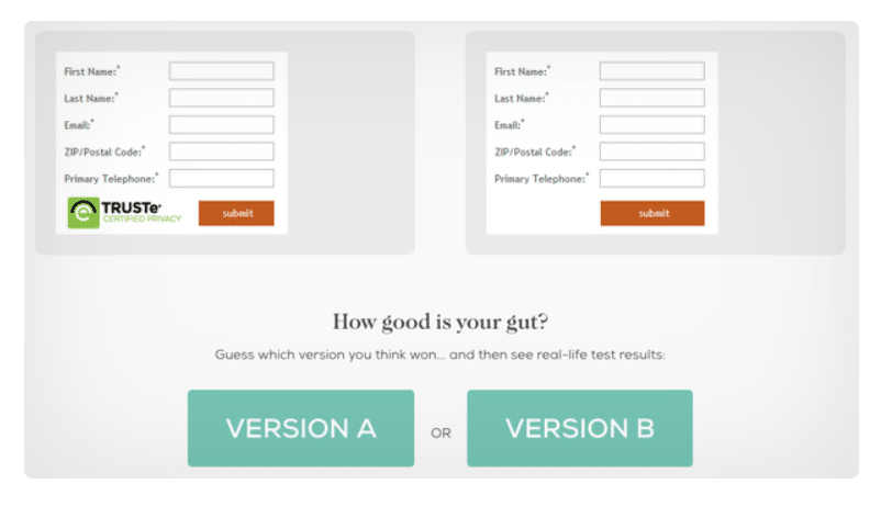
12.6% more users completed the form in version B without badges.
So thats it for now. Please do share your views in the comment section below. Happy Conversions!

