
We want to offer our readers a great article revealing 30 principles for building a successful landing page. Many of these 30 principles have already been covered by us in previous posts. We have collected all the tips for creating a highly effective landing page in one informative, information-rich “final” material.
We are confident that you will receive valuable and useful information that will increase your conversion rates.
You can also read: eCommerce Pricing Strategies For Brave Marketers: 6 Killer Tips
1. Know your visitors.
Creating and thinking over the concept of the landing page is a vital step to high sales. You are guided by a specific type of visitor by the help of these. You should (or at least try) clearly understand the motives, desires, fears and fears of your potential customers; the whole range of feelings and emotions that visitors may experience in relation to the service you are offering. Only in this case, you can create a page with high conversion.
Leading marketers advise starting the optimization of any web project precisely after research. With the study of the target audience, you need to devote a long period to this critical phase of Pre-Click Marketing optimization. It should be from two weeks to a month.
2. Get to the “roots”.
You can use a unique marketing form to know your potential customers more accurately. Answers received from potential customers will help you focus on the details critical to success.
Here is a sample list of questions that should be on your profile:
1. Who is the potential customer of your landing page?
2. The primary demographic data of the client:
For B2C (Business-To-Consumer, “Business for Consumer”) companies:
· Age
· Floor
· Education
· Geographical position
· Income level
For B2B (Business-To-Business, “Business For Business”) companies:
· Industry
· The geographical position of the enterprise
· Annual income
· An annual budget devoted to the purchase of your product or service?
· Who makes the decision to purchase your product or service?
3. Why do customers choose your product or service?
4. Why do customers prefer the product or service of your competitors?
5. What are the five main reasons for customers to buy your product or service?
6. What are the five main reasons for customers to refuse your product or service?
7. How much money is the client willing to spend on the purchase of a unit of goods?
8. How much time will you spend on fulfilling a customer order?
9. Is your product simple to use, or is it a complex product that requires additional instructions and clarifications?
3. Highlight the value of your proposal.
Try to subordinate all the elements of your landing page; text content, illustrations, overall design, call to action (CTA), headline. For one goal: disclosing the value and uniqueness of your proposal. No need to repeat a widespread mistake. One catchy slogan is enough to promote a product or service. Alas, this is not so.
All the elements of which are subordinated to one common task in a holistic page. It will inspire much greater confidence in the visitor and will increase the conversion.
4. Give visitors what they are looking for.
Make sure that visitors redirected to your landing page after clicking on an advertisement/banner. They should come precisely where they need to. The landing page should exactly match the theme of the offer by complementing it. There is nothing worse than sending a potential client to the home pages of your site.
You can hold the attention of the visitor for only 8-10 seconds. So do not force your customers to fish out the information they need from your home page.
The segmentation of the incoming traffic, up to the exact title of the heading must be considered. Correspondence of the advertisement and the landing page are the critical factors. These are the main conditions for the success of your campaign.
Remember! The landing page is a continuation of the advertising campaign, not the site!
5. Pay particular attention to the graphic elements and colour scheme of the page.
Carefully selected illustrations and a thoughtful colour scheme will drastically improve the design of your landing page. It may also emphasize the unity of the link “advertisement – landing page”. You just need to use the same illustrations, logos and fonts both in the ad and on the landing page. The visitor who came through the link from the advertisement will be sure they get what they needed.
6. Let the landing page match the ad.
The landing page should match the advertisement as closely as possible. If the user clicks on the PPC ad “10% discount on …”,
He expects to see the same headline on the landing page.
If a visitor clicks on an ad with a photo of a blonde model dressed in a red cashmere shirt, it should appear again. The visitors expect to see the same model on the landing page too.
7. Remove all distracting elements.
Do not overload the page. Make it as simple as possible. Try to remove navigation menus and links to other pages from the landing page.
8. Do not ask too much information from your visitors.
Your main goal is to convert a visitor to a client as quickly and easily as possible. Do not create unnecessary difficulties for the visitor. Consider letting the user make a purchase as a “guest”, without registering on your site.
If your page has web forms, simplify the process of filling them out. It is beneficial to apply automatic cursor positioning next to the completed form field.
Focus on collecting only the absolutely necessary information. The less time the user takes to fill out the form, the higher the chance of successful completion of the conversion – the visitor will not have time to begin to doubt and think about leaving the page
9. Do not abuse the latest technology.
Resist the temptation to use the latest visual effects of web graphics simply because they are fresh and trendy. It is worth repeating the universal truth once again: “the simpler, the better.”
The meaning of creating a landing page is the motivation of the visitor to perform the desired action. Using luxurious visual effects on the landing page can simply distract the visitor from the call to action. The use of multimedia technologies leads to an increase in page load time that can frighten all potential customers.
10. Gain the trust of visitors.
It is always risky: make deals on the Internet with someone unfamiliar. People are afraid to share money or personal information because they do not know you. How can you gain the trust of your customers by never meeting them in person? The answer is simple: trust breeds trust.
11. Focus on one goal.
Make no mistake by offering multiple products on the same landing page. A visitor clicks on a link or sends a request to a search engine out of curiosity precisely because he is interested in a particular product or service.
Remember! One product on one landing page! We will consider the behavioural factors specific to on-line shoppers in the next posts.
You can also read: The Secret To Creating Killer eCommerce Product Pages
12. Avoid technical errors.
Any technology has its drawbacks, and not always everything works as planned.
Try to avoid “technical errors.” Always check that all links, buttons and forms on your landing page are working correctly. Conversion is not possible if your potential customer clicks the “Place an order” button, but nothing happens. Such errors cast a shadow on your reputation and do not reflect good work. It should reflect the best work on the perception of your product or service.
Here is a simple tip: check your links as often as possible to avoid many problems.
To avoid compatibility issues, make sure your landing page works with all common browsers (Internet Explorer, Netscape Navigator, Mozilla Firefox, etc.). Also, test it on all operating systems (Windows
Vista, Windows XP, Mac OS, etc. )
13. Promise your customers privacy.
You must promise your customers that their privacy will be inviolable. Make sure your privacy policy is laid out in a simple and accessible language (and if your security policy has not yet been published on your landing page, do it right away). Let customers know that you guarantee their safety.
Post links to your privacy policy or a simple statement “Your privacy is important to us, or No spam”. It must be added in the immediate vicinity of the call to action elements.
14. Give customers a money-back guarantee.
Give your customers a product warranty or trial period for the service. For example, you can provide customers with a 30-day trial period for your product with a full refund guarantee. You can also offer free consultations for new clients. That will make the client feel that he is receiving a particular service without spending money.
All these measures can help increase conversion. Doing so will let visitors know that the transaction risks are minimized. Make sure visitors to your landing page can easily see and understand your security policy and your warranty.
15. Post reviews of satisfied customers.
Never underestimate the power of kind words spoken to you by satisfied customers. When a potential client reads good reviews from previous customers, he will be more inclined to join a business relationship with you.
Find reviews in which customers talk about the benefits of your product/service for your target audience. The review looks very good, equipped with the full name, place of residence, profession, position and photo of your customer. And of course, never stoop to post fake reviews!
16. Use additional elements of trust.
And here is another great way to gain trust with potential customers. Place on the landing page citations from the media that positively covers your activity. It should include certificate numbers, images of diplomas and certificates of honour, evidence of membership in various business unions. It should have everything that a potential client considers a sign of a solid and reliable organization.

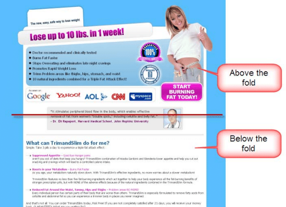
17. Remember the “inflection line.”
The “inflection line” in web design is usually called the lower border of the image on the monitor. All materials on the web page below the “inflection line” require scrolling to scroll through them.
Try to avoid placing “vital” landing page elements — such as a call to action — below the “inflection line”. Unfortunately, there are no exact recipes for determining the size of the visible part of the landing page. Different browsers at different monitor resolutions display the page each in its way.
18. How to make a page without scrolling.
Among web designers, there is a “golden rule”. The page is being layout under the so-called “least common denominator”-the screen resolution of 1024 x 768 pixels. Designing pages of this format will mean that only 3% of PC users (those who still use a monitor resolution of 800 x 600 pixels) will resort to scrolling.
Remember! At a given screen resolution of 1024 x 768 pixels, your page should be slightly smaller than this size. It will take into account the space occupied by menu items and the borders of common browsers. Based on the foregoing, your page size should not exceed 950 x 750 pixels.
Many visitors will not scroll through the page to find out what information you have placed below the “inflection line”. Therefore, it is imperative that the call to action element is above the “inflection line” – the visitor should see it at a glance.
19. What can be placed below the “inflection line”.
Sometimes it is necessary to place text content below the “inflection line”. This is not a big deal since your page will be visited by various visitors with different types of characters. The most valued type of visitor — attentive and patient — will use the scroll bar to get answers to all your questions.
20. Where to place a call to action elements.
Depending on the length of your page, you may need more than one call to action element.
Remember! A fundamental rule: place one CTA (call to action) element on each conditional “screen” with a height of 400-500 pixels. When creating a page, try to avoid empty spaces near the “inflection line”. The reader should know that the page continues beyond the bottom of the monitor.

21. What should a visitor see at a glance at your landing page?
Place the most critical elements (graphics, text, etc.) In the centre of the visitor’s field of view – in the middle of the upper part of the monitor. Try not to use the side panels for page layout. They distract the visitor from the optical centre of the page.
Your headline and call to action should be very noticeable. The visitors who only “glance” at web pages (most of these visitors) would be able to accept your offer.
Use bold, vibrant, and large fonts and images to create the essential parts of your landing page. A quick look at your landing page should be enough so that the visitor understands what kind of product/service you are offering.
A good landing page design should “push” visitors’ eyes toward the call to action element.
Remember! Visitors to a web page, as a rule, begin to view it from the upper left corner and gradually move to the lower right corner. A good landing page design should fit that direction.

22. Use images on the page correctly.
In addition to the main images (see below – “the correct picture”), you can use additional graphic elements to convey the message to the visitor.
If you want to convey some technical information to the user, try using a chart or graph to reveal your point of view. Most users perceive visual images better.
However, do not overdo it with the graphics. Additional elements should not distract the visitor from his primary goal – conversion. And be careful, try not to highlight less important information. It can become more noticeable than the primary information for which the landing page was created.
23. Use the appropriate “language”.
Make sure your landing page is easy to read. It would seem that everything is evident with this question. However, all too often, the content of the landing pages is filled with corporate and marketing jargon. It sounds too uninitiated as the Martian language.
Remember! You write texts on the landing page not for yourself, but for visitors. They may not know many terms and slang expressions. They just want to sort out your offer. Help them make the process easier and understandable—for example, a description of the benefits of your product in a numbered list format. A clearly structured page with text written in a simple language can increase conversion literally at times.
24. Do not confuse visitors.
If you want a conversion on your landing page, you must explain to visitors what to do and in what order. Your landing page should be easy to navigate, with a clear call to action and clearly visible elements used to convert (web forms, confirmation buttons, etc.) To the course. A call to action and all-important links should be visible at a glance at the page.
25. Provide visitors with additional conversion methods.
Even after the visitor to the landing page has decided to perform the proposed action, you shouldn’t calm down. The visitor may not go through the entire conversion process to the end if the conversion does not go as fast and smooth.
Offer your additional visitor options. For example, let him be able to contact the sales department in various ways to choose from: by phone, via webchat, fax or email.
26. Come up with the perfect headline.
The title of your landing page may fail the transaction or lead to its successful completion. The fact that a visitor is on your landing page means a good thing. That he has read your ad and is interested in reading it further, the headline should encourage the visitor to further explore your proposal.
The title should be as close as possible to the meaning of the advertisement. But it should contain some kind of riddle that the visitor can solve on the landing page.
Remember! The visitor must be sure that by following the link from the ad, he got to the desired, correct landing page. And that this page was created specifically for him.
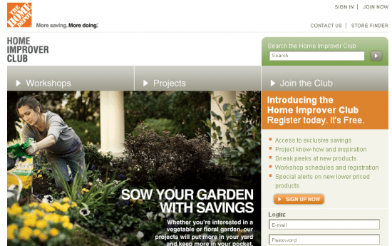
27. Use the “correct picture”.
There is old design wisdom that says: “A picture is worth a thousand words.” This statement can be verified by the example of the landing page. You have only 8 seconds, and you must grab the visitor’s attention before he leaves it.
However, correctly selected and placed graphic illustration can firmly capture the attention of the visitor. When viewing a landing page, a visitor first draws attention to 3 components: the main picture, the title and the overall design of the page.
The most important criterion when choosing an image is its relation to the product or service being promoted. For instance, you must have a pic of a mobile if you sell mobile phones. The magnificent photograph of the device will demonstrate to the potential buyer the goods that he will receive.
If it’s hard for you to pick a photo that literally illustrates your offer, there are other options too. You can use the graphic elements that were used in the design of your promotional offer. In general, do not neglect the rule of “graphic continuity”. The visitor will feel much more confident on the page with the graphic design familiar from the announcement.
28. Create an energetic call to action.
Remember the simple rule: “one landing page – one CTA”. Create your call to action – an energetic concise phrase using a verb. That particular verb should describe the action you expect from a visitor to your page: “Buy now!” “Register here!” Etc.
29. Simplify your data collection forms.
If the goal of your conversion is lead generation, try to make the lead form as straightforward as possible.
Rarely, a full postal address may be required. Users are reluctant to publish their phone numbers for fear of becoming the next victim of obsessive telemarketing. Two form fields are sufficient in most cases: name and email address.
However, there are exceptions to each rule.
Remember! The number of lead form fields is directly related to your marketing task and the quality of the lead itself.
30. Know when to use short landing pages, and when you need “long”.
Among the most authoritative landing page gurus (Tim Ash, Tim Ash), there is still a debate about the length of landing pages. Some experts believe that when using “long” pages can explain better. The one containing more illustrations and text can better explain to visitors the benefits of your product or service. Others believe that a “short” page reduces the risk of your visitors fleeing, and therefore it’s better.
There is no definitive answer to the question about the length of the landing page. However, there are a few general principles that you should consider when trying to determine the length of the landing page.
Short pages are generally better suited to offer gifts or free services. If visitors want to get something for free, they are unlikely to read lengthy texts. As they just want to get something “for free.”
A “long” page will work well if you are selling a reliable, expensive product. Visitors want to know all the advantages of a prestigious, expensive product before they reluctantly part with their hard-earned money.
31. Gift tip: we know which landing page elements have the most significant impact on conversion growth. Now you will know.
There are many elements on the landing page that you can subject to split testing. However, we believe that the following elements affect the conversion rate in the most dramatic way:
· The presence and location of security icons, a mention of the privacy policy;
· Bright, eye-catching image corresponding to the proposed product or service;
· List of benefits of the product/service;
· Call to action;
· Customer reviews;
· Page layout.
Remember! Only regular split testing can provide objective data of what exactly affects the conversion of your landing pages. Allow enough time for the split test and test all the relevant elements on your pages. It will become more comfortable for you to understand what your users like and what they pay attention to. Based on these data, you can raise the conversion to double-digit indicators!


 I Target?")

